Girls Just Wanna Have Fun
Girls Just Wanna Have Fun
Custom website redesign for a girls’ summer camp
2013 | Web Design & Content Loading
Project Overview
This website redesign began with a rough draft main template, designed by Nicholai Ronningen of Ronningen Design, which defined the basic layout and design direction of a typical page on the site. I used this page as inspiration for sketching and creating mockups for all the other major pages (home, blog templates, landing pages, etc.). I also made decisions about the finer details such as body copy font and heading styles, and I took the lead on sorting and selecting photography.
As the site development progressed, I loaded content for all the main template pages (the majority of the site), formatting text and processing/placing photos. Toward the end of development, I took the lead on testing the site across major browsers and devices.
Main Template Page
In this example of a typical page, I selected and placed all the photography including the subnavigation thumbnail images. I'm particularly pleased with the intriguing photo grids.
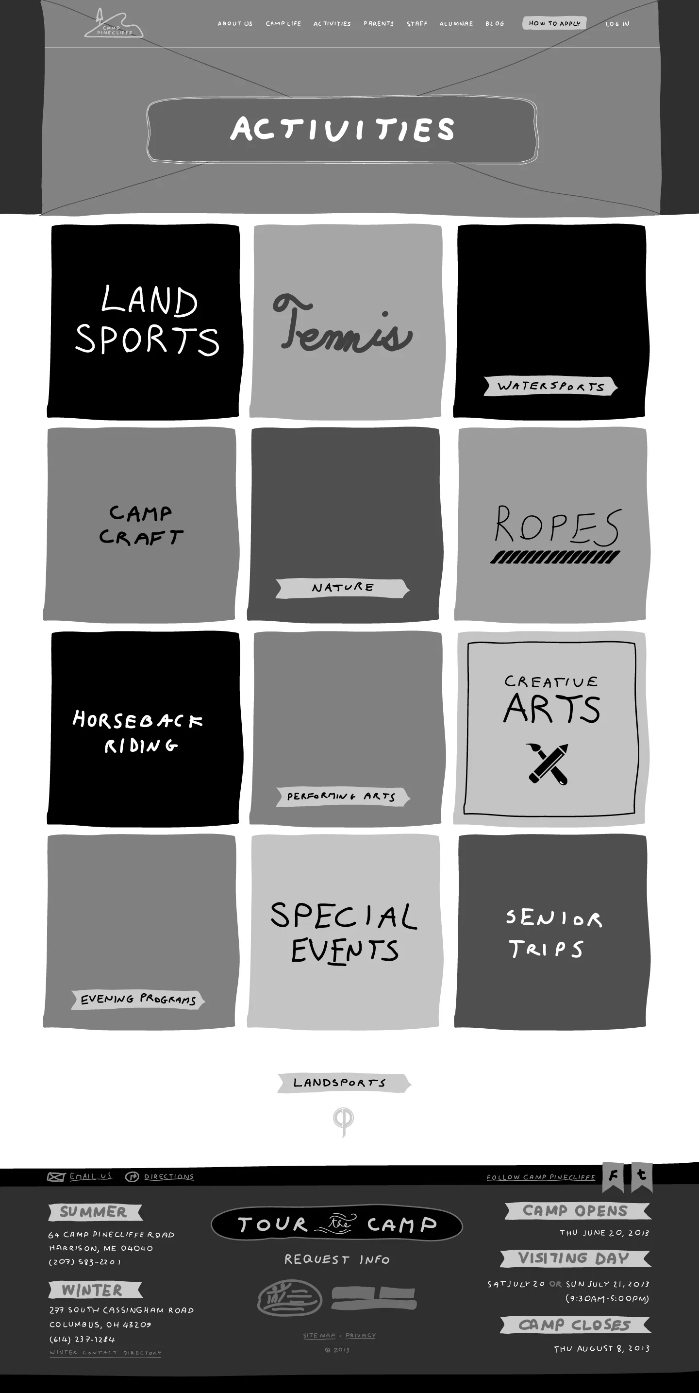
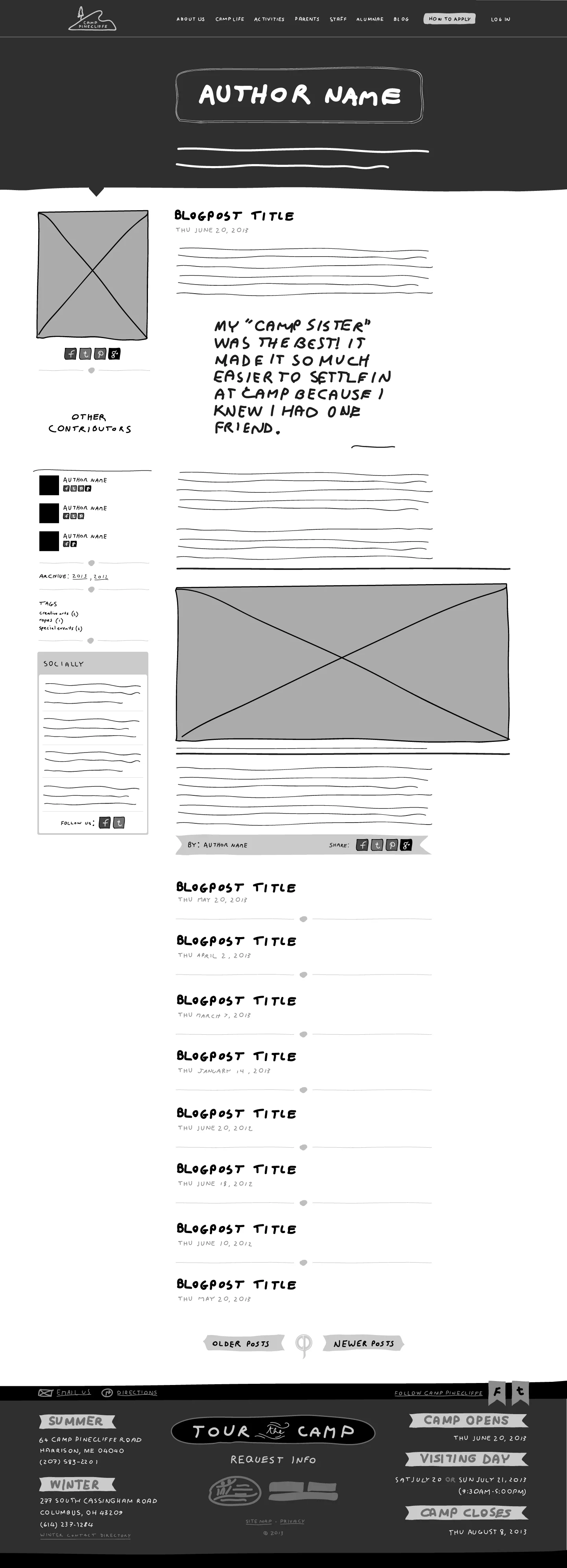
Sketches
With the main template serving as the starting point, I created sketches at predetermined breakpoints for the important templates.
Click any of the following images to zoom in.
Finished Pages
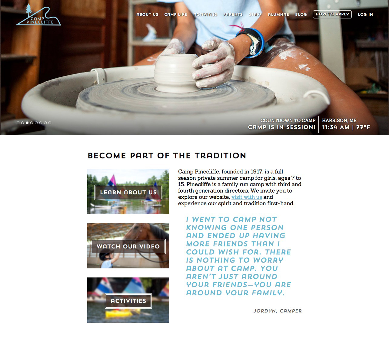
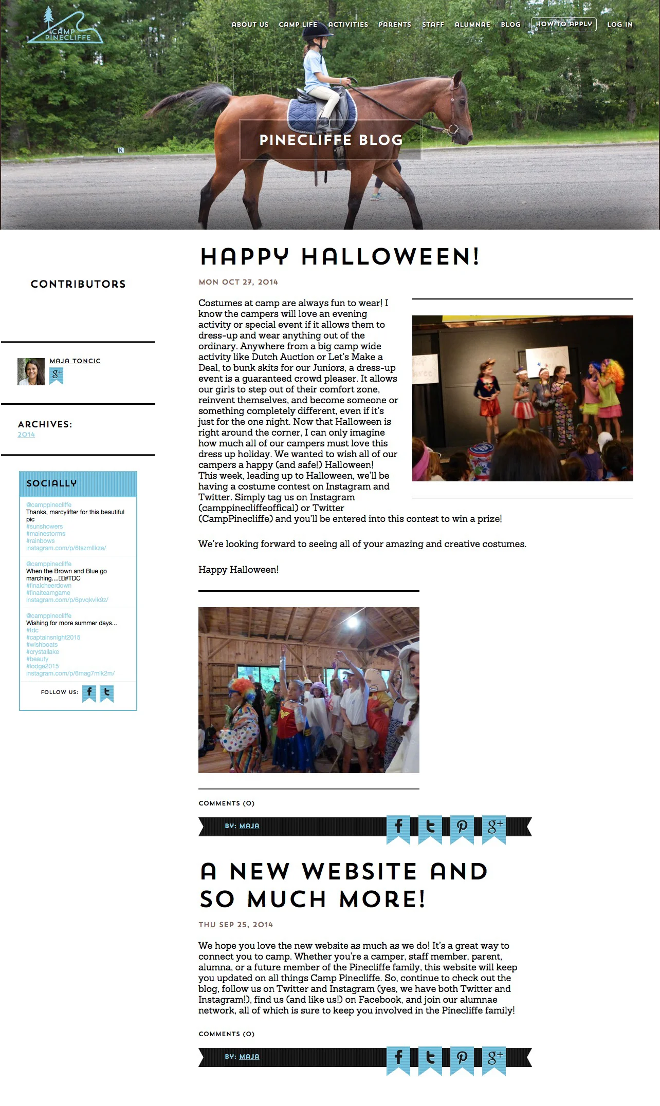
I based the mockup design on the foundational sketches. Approved designs were then passed on to the client's developers to build the site. As development progressed, I loaded content, formatted text and placed photos. The following are examples of finished pages.
Home Page
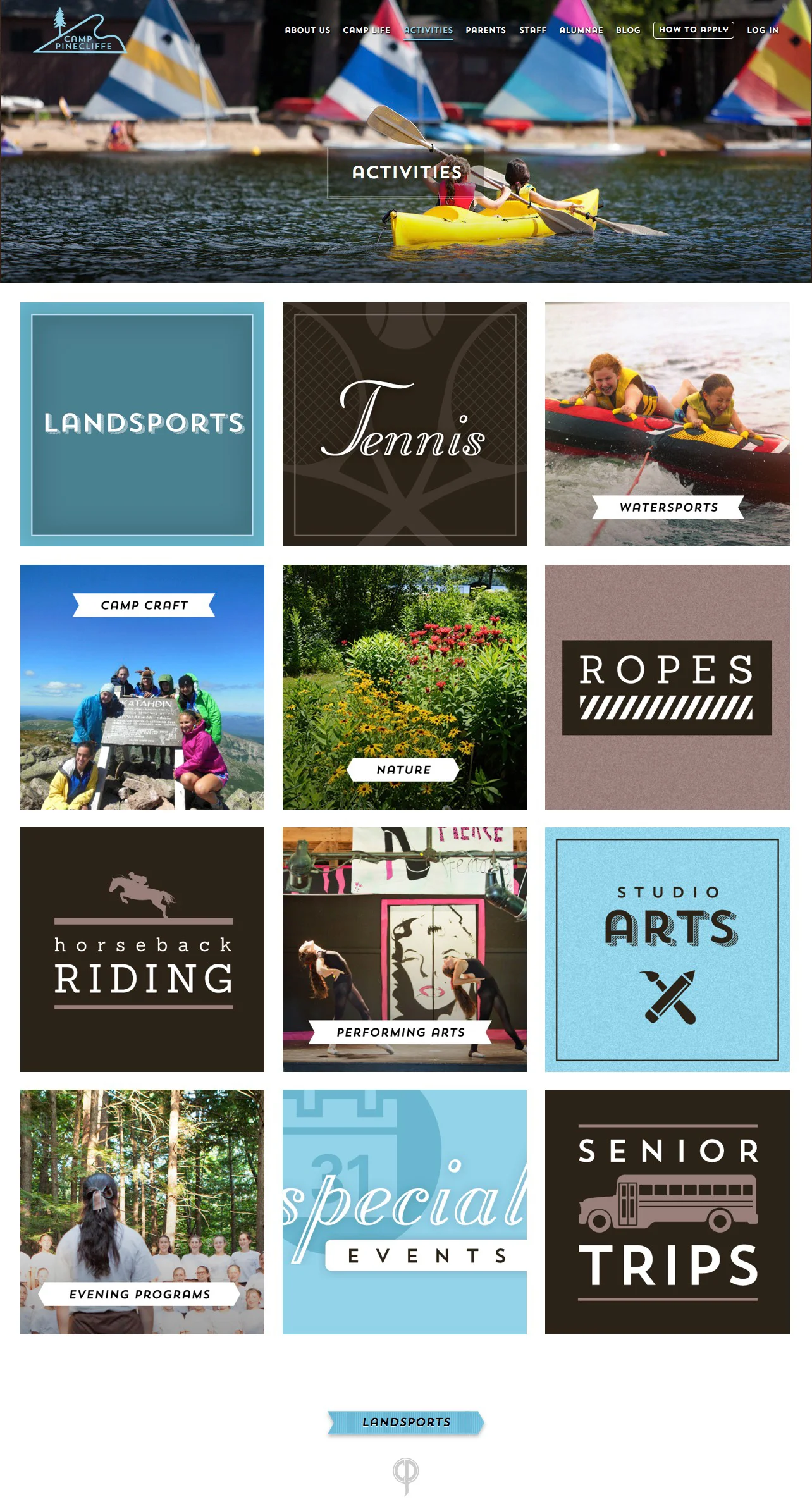
Activities Landing Page
Here's a fun idea for subnavigation. I gave each activity its own illustrated block, combining photos with other graphics and artistic typography.


