Don't Toot Your Own Horn
Don't Toot Your Own Horn
Highlighting customer reviews for a disaster relief company with 30+ years in business
Project Overview
2017 | Web Design, Development, & Content Management
My client, a disaster remediation company, reached out to me in March 2017 with a vision for improving their company website built on a WordPress theme. The primary goal was to better emphasize customer reviews. The secondary goal was to improve the design of the website without starting over. As a brief summary, my solutions involved:
1. Redesigning the home page & building it out with the WordPress page editor and custom CSS,
2. Designing and implementing custom graphics, including a custom quote style to place reviews across the site,
3. Embedding a reviews widget on the Reviews page. This allows all customer reviews from various outlets (Google+, Yelp, etc.) to display in one place and update automatically. Previously, the Reviews page contained only a few custom-styled quotes, while the reviews widget was only accessible from the home page.
4. Rethinking the website architecture,
5. Modifying a number of the styles (typography, colors, etc.). to create a more consistent design across the site,
6. Reorganizing a few page layouts to give prominence to important content such as videos and key info about company services,
7. Ensuring that all changes displayed properly across all major browsers and devices.
Home Page Redesign
Considering the two main goals of the project, it seemed best to me to assess the home page first. See the following screenshot of the old page for reference, with my comments below it.
Old Home Page
This page was an acceptable starting point, but there was room for improvement:
1. The home page is a natural location for customer quotes, but the quotes were downplayed, seemingly treated as the least important content on the page.
2. The opening section below the navigation was cluttered and did not distill the company message into anything clear or memorable.
3. Further down the page, the social media was mixed with FAQ content, and the whole section felt disorganized, with the dividers creating more problems than they solved.
Home Page Redesign Mockup
I set out to solve those problems as follows:
1. I created a more prominent quote style (the blue block) that could be repeated on the home page and be placed on other pages of the site. My first idea was actually to design two quote styles, leading off the home page with one that was unique: a customer photo overlaid with a quote. The thought was that showing an actual customer paired with a quote would communicate a sense of trust. That idea was received well, but it proved too difficult for my client to get a good customer photo.
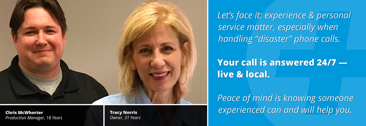
2. The eventual solution we settled on for the opening section is to lead off with a slideshow (shown further down in the screenshot of the built page). One slide directs traffic to the Reviews page and the other slide gives assurance of 24/7 availability and quick response — both of these build trust in the company.
I pared down the descriptive details to just the two main paragraphs and increased the body copy size for better readability.
3. In the initial mockup I organized the social media and blog feeds in three columns and took the video FAQ full width, splitting up this content with one of the newly styled quotes.
Below is the mockup I presented to the client, with my notes and questions added in red.
Built Home Page
Below is a screenshot of the built page. Comparing this page to my mockup, you'll see some differences. This extra work did not require revised mockups; most of it was negotiated verbally, while the new graphics and slides were approved before being placed on the site.
Second Slide
Comments on Built Page
1. During development I discovered a pre-existing problem with the behavior of the header, as originally it was not set up to respond well to changes in browser width. While fixing this issue, I restyled the phone number section to better match the rest of the site.
2. At the client's request, I designed new graphics for the Services (Water, Mold, Fire & Smoke, Specialties).
3. To trim page weight, I replaced embedded videos with images that link elsewhere to the same content. With this change, it made sense to reduce the customer review video section to one row of placeholder images (since the videos don't play in context, nothing is lost).
4. At the client's request, I designed custom social media graphics, which added a fourth column.
5. The navigation (shown below) reflects my complete thought process on restructuring the site. During the mockup phase I only had "About Us" swapping places with "Blog". Upon further review, it made a lot more sense to re-categorize a number of pages under a new "FAQ" section (many of these were previously under "Disaster Media".) This reduced the "Disaster Media" section to simply "Photos." This new architecture is more clear, helpful, and logical. It may even help with SEO.
Internal Page Redesign
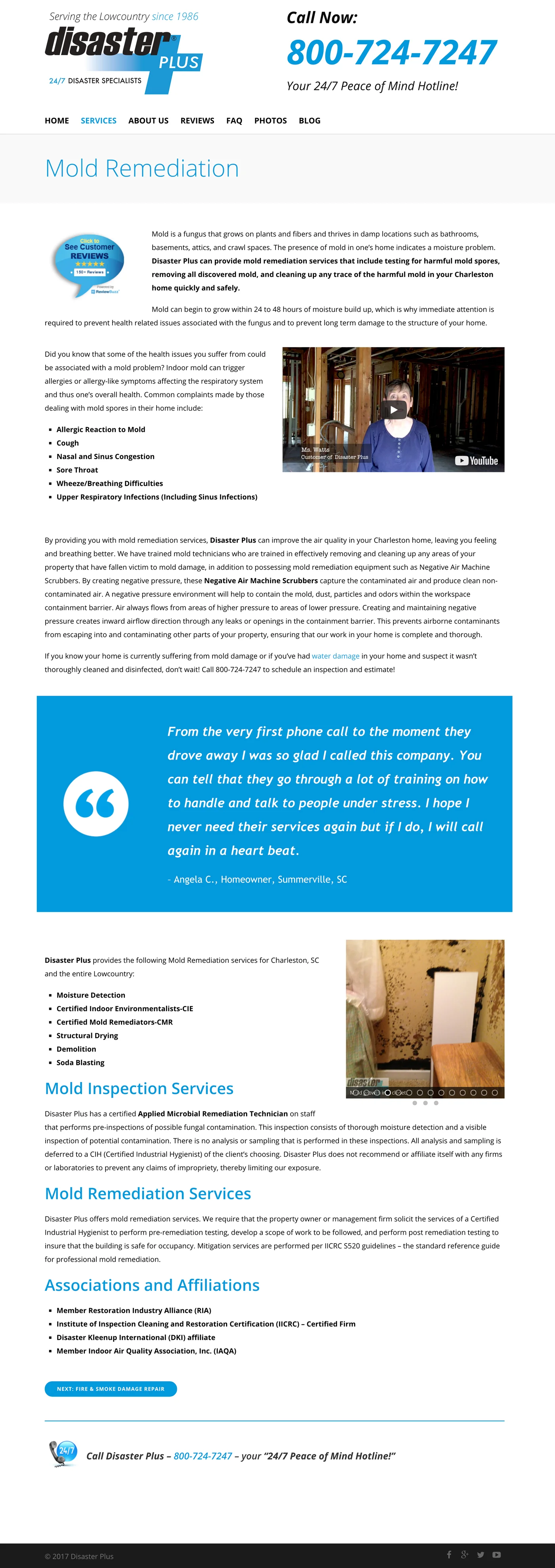
The Mold Remediation page shown below reflects the changes I made to the typical internal page.
Summary of Changes to Internal Pages
1. I placed customer quotes and the small Reviews graphic on all the important site pages. Previously those elements were only on the home page. I set up the Reviews graphic to direct traffic to the Reviews page, helping to fulfill one of the major project goals.
2. I cleaned up all the page titles (H1s) and harmonized them with titles used in navigation. These were cluttered with keywords and references to location, aiming to optimize for search engines, I assume. SEO strategy should make that info visible, however, the displayed page headings are not the place to do this. You want to make sure your meta titles and descriptions are as thorough and keyword-filled as possible. The best page titles are descriptive but only as long as they need to be. The title on the page should match the navigation anchor text to create a sense of assurance that you've arrived at the page you expected to reach.
3. I tweaked heading styles, standardizing colors and choosing appropriate sizes and weights, to provide a better hierarchy.
4. I adjusted page layouts, re-positioning videos, slideshows, and other important pieces of content for maximum effectiveness.
5. I added next links throughout the site. It's helpful to give people somewhere to go next, leading them through the flow of the site, rather than leaving it to chance.
6. I removed the breadcrumb trail that was included on the right hand side of the title bar. Breadcrumb trails are useful in many cases, but my client's website is not very deep or wide, so the trail only served to get in the way more than anything else.
7. I standardized the call-to-action in the pre-footer ("call Disaster Plus..."). previously there were lots of different versions of this element across the site, as if they were each designed separately.


