Conference Calling


Collaborating on a 50-page conference program
For this 50-page program, I teamed up with Chuck Fultz of Ronningen Design to update the previous year's design. This was mostly a matter of updating layouts with new content, but also included designing new pages and a few advertisements.
6-7 AD / PROGRAM AREAS
I created a fresh layout for the Program Areas page. The conference session topics are divided into five color-coded categories.
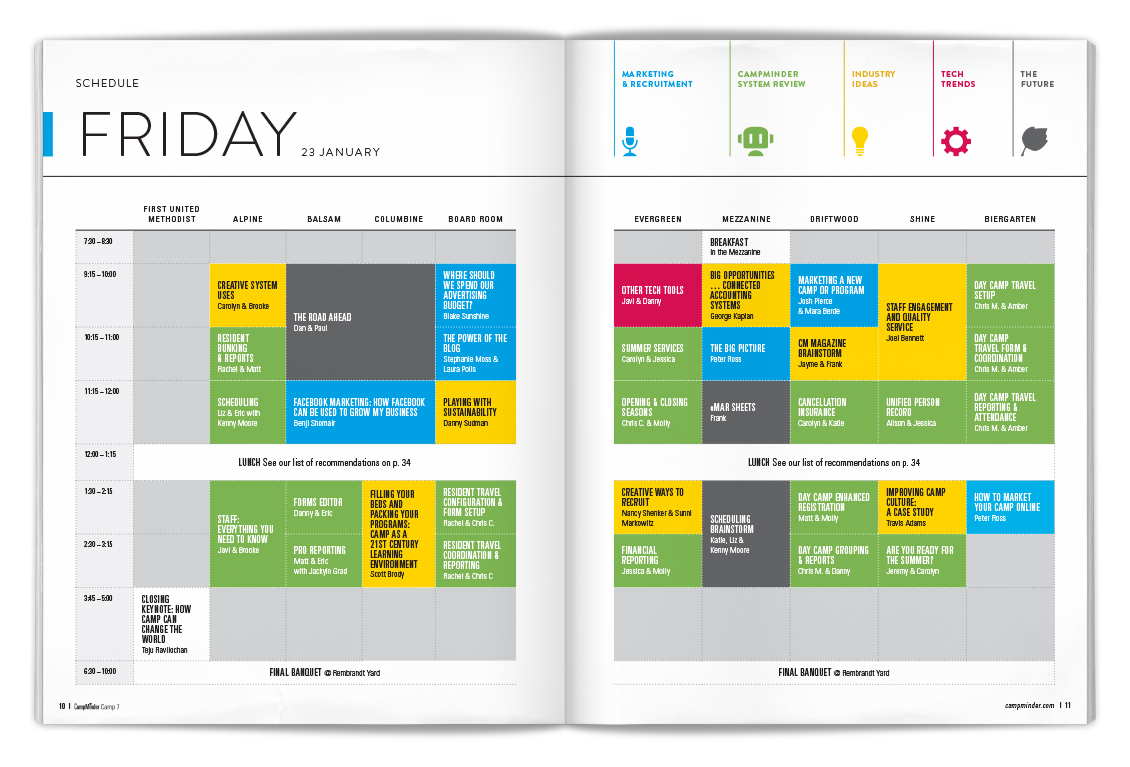
10-11 FRIDAY SCHEDULE
Managing the schedule updates was a project in itself. For the two-day conference, the speakers, session times, and locations were continually changing up until the program went to print. So I had to keep pace to maintain accuracy and layout integrity.
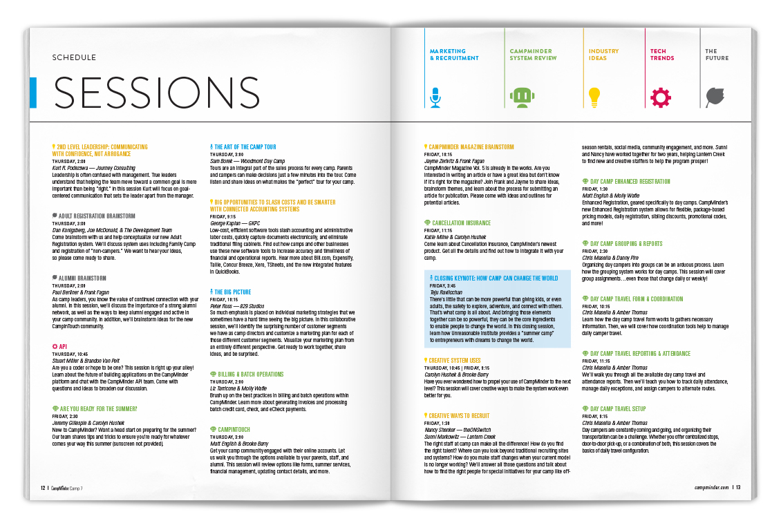
12-13 SESSIONS
As I handled the most important session details in the Schedule, I also updated the descriptions in the Sessions index. One of the challenges here was to estimate how many pages the section would require — but without a complete set of descriptions at the outset.
20-21 SPEAKERS
Similar to the Sessions index, I managed five pages of speaker bio updates. The main challenges were to use the layout space economically and to minimize text wrapping across columns.
24-25 SPEAKERS / AD
I designed the ads on the right-hand page for the major "extracurricular" events surrounding the conference.
26-27 STAFF DIRECTORY
I loaded new client staff avatars, photos, and personal info.
34-35 WHERE TO EAT LUNCH / AD
I managed the content and layout updates for the lunch recommendations page.
48-49 AD / SURVEY
I designed the survey — a new page in the 2015 program.