Marriage Is What Brings Us Together Today


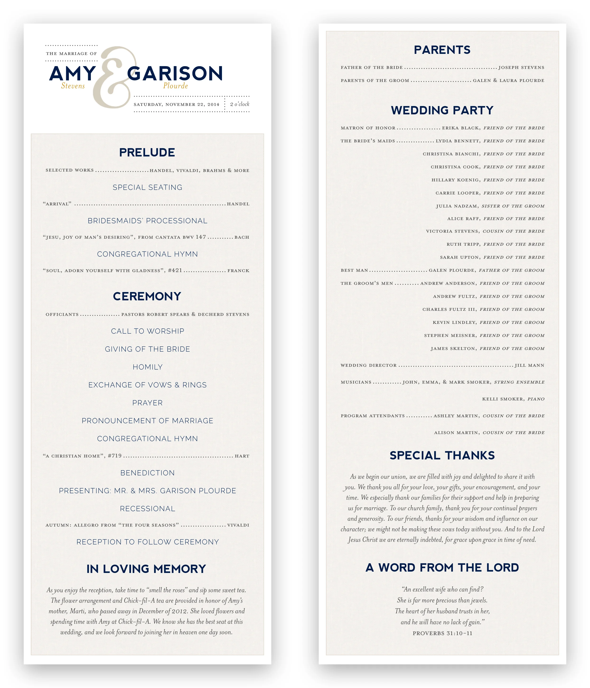
Invitation and program for my own wedding
Invitation / 8.5" x 3.5"
I love ampersands. I also love the simplicity and personality of this design.
People connect with stories, so I presented a photo narrative of my engagement to Amy — who is now my wife.
The RSVP is a subtle nod to a web call-to-action button. While it's not interactive (print design!) the strong color contrast draws the eye, and the contact info is presented right below.
Program / 3.5" x 8.5"
A great wedding program design is difficult to come by. The complexity of the event tends to lead to packing a lot of information into the printed program. From musical selections to stages of the ceremony to wedding party rosters, there is much to be organized. The twin dangers of clutter and confusion lurk on either side of the way forward. For this reason I have probably seen more wedding programs that I don't like than those I do.
As many have said, about 90% of the design work is typography. Here the clear differentiation between headings, subheadings, and granular details instantly pulls the attendee into the reading experience. Careful attention to alignment helps one to easily discover information.